Many of us can remember a day back in elementary school when we were given three globs of paint to mix together. By creating orange, green, and purple, we illustrated the fundamentals of color theory. Red, Yellow and Blue are the basis for all other pigments. Any other color relationship can be viewed in terms of how it relates to the primary colors.

Color theory can be extremely useful when making outfits because colors can dramatically change a look. For example, there is a big difference from wearing a black shirt with black pants than wearing a white shirt with black pants. Knowing which colors look good together and how they can change the look of the body can completely up your style game!
Let’s start with the basics……
THE PRIMARIES

ELECTRIC. FRESH. RETRO. CAPTIVATING. DYNAMIC.
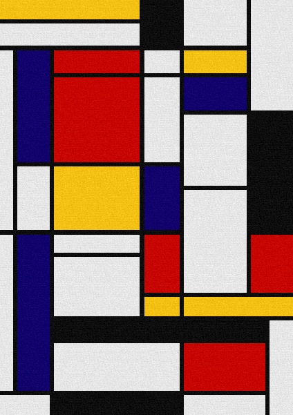
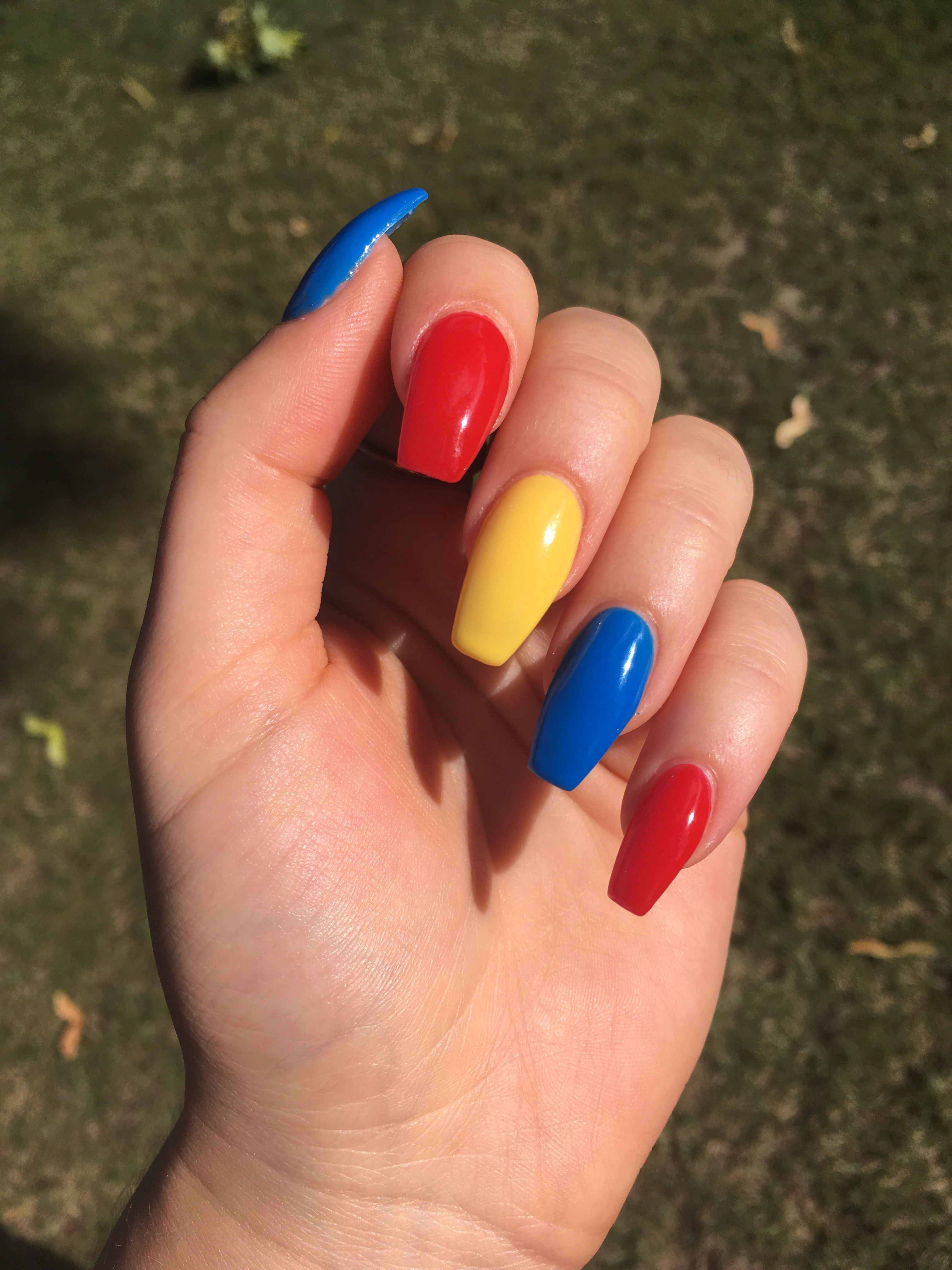
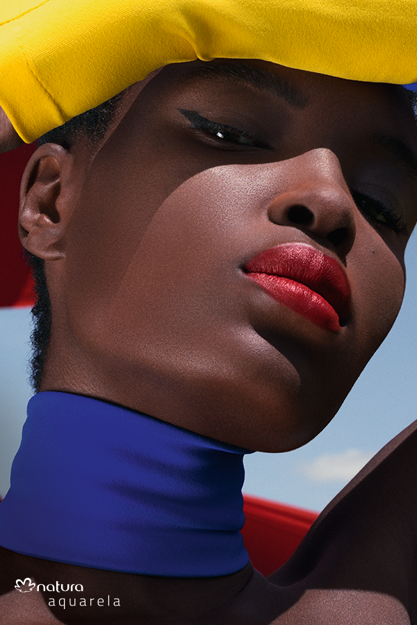
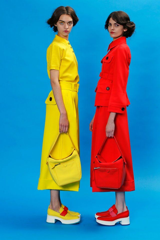
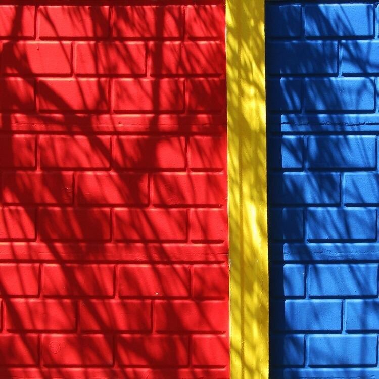
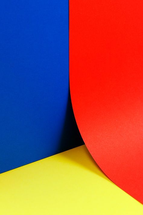
I am personally drawn to the primary color scheme because I love high contrast imagery. The more contrast, the more likely it will catch the eye of the audience. I think the level of intensity between red, yellow, and blue creates a look one can’t look away from. There is something so interesting about the primary colors that even other triadic color schemes like the secondary colors cannot match. Red, yellow, and blue are so dramatically different that it allows each of them to truly shine in their own way compared to other triadic groups which are various mixes of these three central pigments.
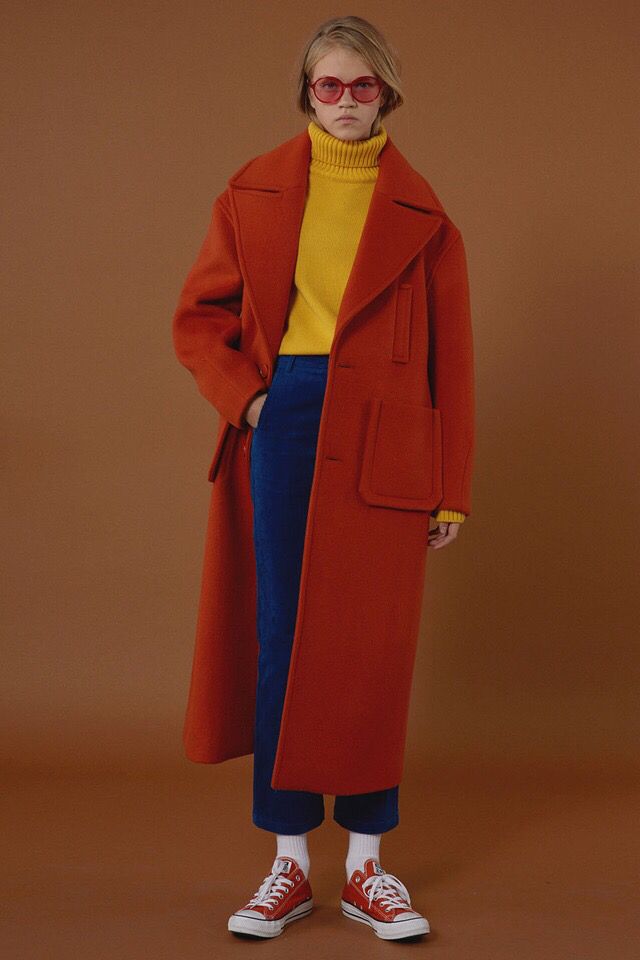
HOW TO APPLY IT TO YOUR OUTFITS:
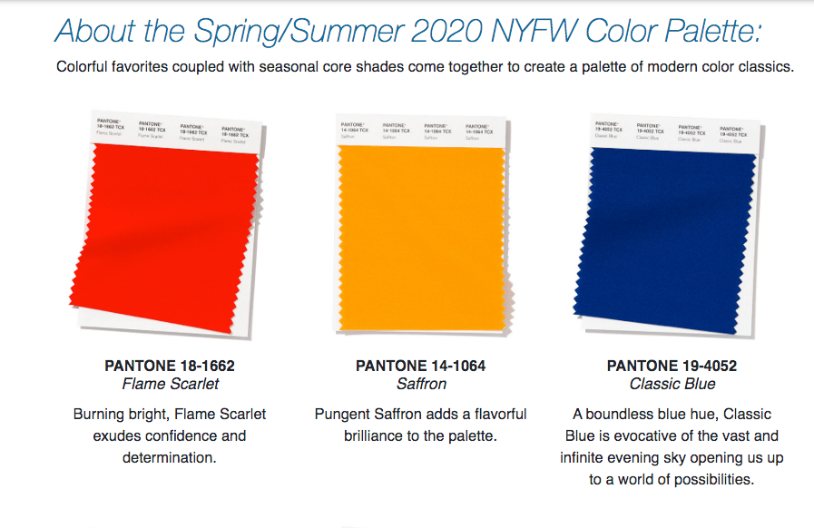
The easiest ways to use the primaries as inspiration for an outfit is to use them as an outline, not necessarily an exact color pallette to strictly pick from. ‘Flame Scarlet’, ‘Saffron’, and ‘Classic Blue’ all together would be a lot for one look. To incorporate all of the colors, start with picking a main color and accent with shades of the other two.
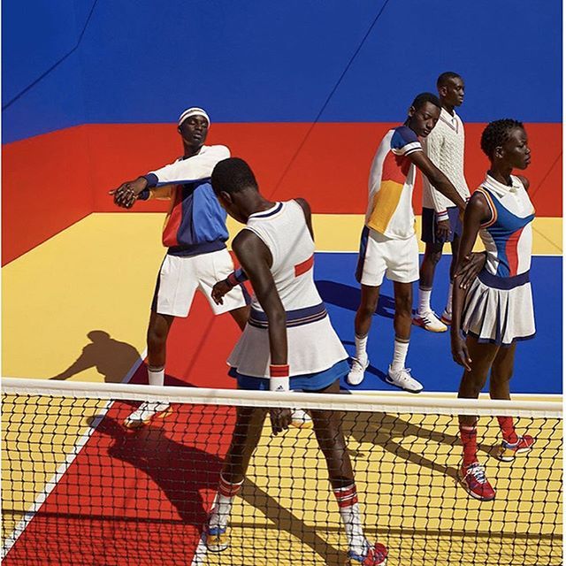
How Designers Do It:
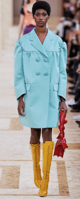
On the left, Miu Miu takes on the classic yellow rain boot with a pair of ‘Saffron’ pointed toe lace up riding boots. To accent, the model wears a pastel teal double breasted coat paired with a rich ruby bag.
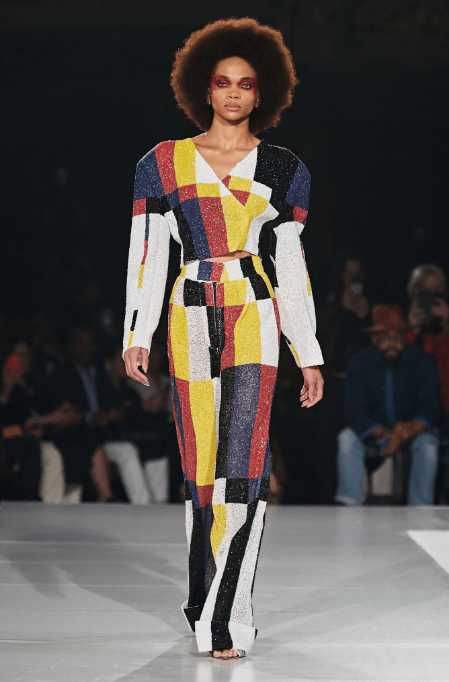
Pyer Moss’ opening look pays homage to the 80’s suit with a geometric color block printed two piece set. ‘Classic Blue’ is used as one of the colors for the squares paired with a buttery yellow and crimson to compliment along with black and white.
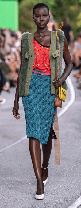
A look from Coach’s SS2020 Collection utilizes ‘Flame Scarlet’ as the electrifying tone for a playful sequined one shoulder top. The look is completed with a deep turquoise printed midi skirt paired with a mustard shoulder bag.
By using the Pantone colors for inspiration, these designers elevated their looks with the use of an age old color scheme.

Great article. Very informative loved it
LikeLike